

Data. In our modern world, it’s everywhere. With the increase of digitized information, we have access to more data points than ever before. And Excel is one of the most popular tools for dealing with this data. But as any data analyst can tell you, large datasets can be a double-edged sword. Yes, they hold a wealth of information. But that information is only as good as your ability to understand and interpret it. That’s where pivot tables come in.
If you want to follow along for this, I’ll be using ‘the Financial Sample’, available for free from Microsoft.
What is a Pivot Table and Why Use It?
A pivot table is a powerful Excel feature that allows you to extract the significance from a large, detailed dataset. It’s essentially a summary tool that lets you analyze, explore, and visualize your data in a multitude of ways. If you need to condense a comprehensive data set into bite-sized, understandable bits, pivot tables are your go-to tool.
Why should you use pivot tables? Simply put, they save time and energy. They do the heavy lifting for you, allowing you to crunch numbers, identify trends, and extract insights without having to write complex formulas or use multiple worksheets. If you have a large dataset and you need a flexible, user-friendly way to analyze it, pivot tables are the answer.
Creating Your First Pivot Table
Creating a pivot table is easier than you might think. Suppose you have a spreadsheet full of sales data (convenient, huh?), with rows representing individual sales and columns for things like product type, sales region, and sale amount. You want to find out the total sales for each product type. Rather than manually sorting and summing the data, you can create a pivot table.
Here’s how you do it:
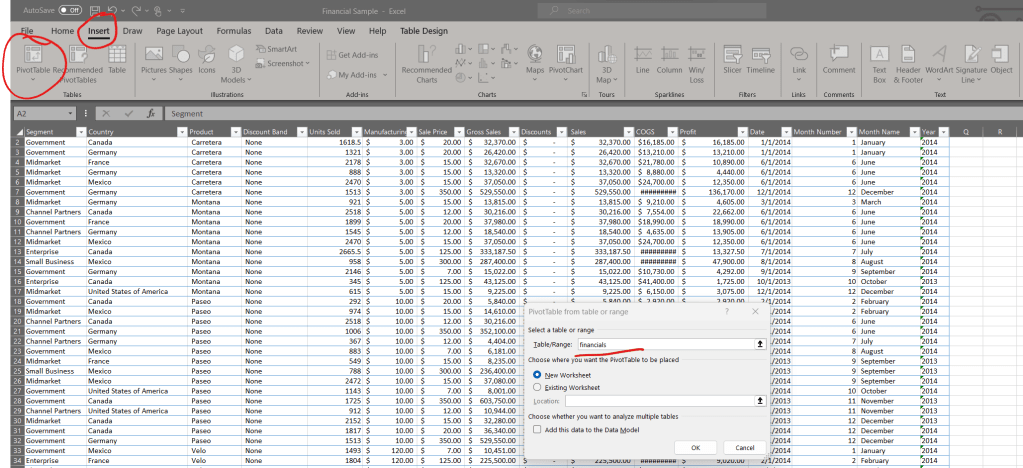
- Click anywhere in your data set. Excel needs to know which data you want to use for your pivot table.
- Go to the “Insert” tab on the Ribbon and click “PivotTable.”
- In the Create PivotTable dialog box, ensure the Table/Range field corresponds to your data set, and choose where you want the PivotTable report to be placed.
- In this example, the data comes preformatted into a table, so the underlined portion will show the table name, rather than the cell range.
- Click “OK.” You’ll now have an empty pivot table and a PivotTable Field List pane where you can start specifying your analysis parameters.
Basic Operations
The real fun begins when you start playing around with the fields in your pivot table. By adding, removing, and rearranging fields, you can view your data from various perspectives. The four areas of a pivot table – Rows, Columns, Values, and Filters – allow you to manipulate your data as you see fit.
These boxes sometimes confuse newer users, so it pays to remember that rows will be how things are grouped vertically while columns will group things as you move horizontally across the worksheet. Anything you put in either of them will have its unique values listed as headers, rather than as part of the calculated data that makes up the majority of the table. Values are what go in the larger section, and anything you place into the filters box will create a dropdown above the main body of the pivot table to act as a filter.
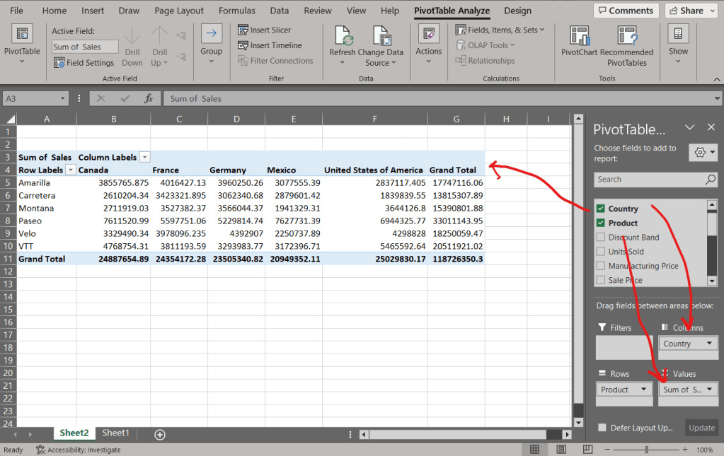
Let’s go back to our sales data example. You can drag the “Product” field to the Rows area, and “Sales” to the Values area. Just like that, you have a summary of total sales for each product.
But what if you want to view sales for each category by country? Simply drag the “Country” field to the Columns area. Now you have a comprehensive, easy-to-read summary of your sales data, broken down by product category and country. It’s that simple.
Using Calculated Fields and Items
Calculated fields and items are one of the ways pivot tables show their real power. They allow you to create new fields based on the existing ones, which enables more specific and tailored data analysis. In other words, instead of manually calculating values in your source data (and inflating your file size), you can use a calculated field to do the work for you!
Here’s how you add one:
- Click anywhere in your pivot table.
- Go to PivotTable Tools on the Ribbon and click on “Fields, Items & Sets,” then choose “Calculated Field.”
- In the dialog box, give your field a name (I chose “GP”).
- In the “Formula” field, construct your calculation. You can type your mathematical operators, double click on field names in the list below, or click a field, and click the ‘Insert Field’ button to insert fields from your pivot table into the formula.
For instance, let’s say we have a pivot table that tracks sales and costs(COGS = Cost of Goods Sold). We can create a calculated field named “GP” (Gross Profit) with the formula =Sales-COGS. Now, your pivot table will automatically calculate the profit for each row in the table.
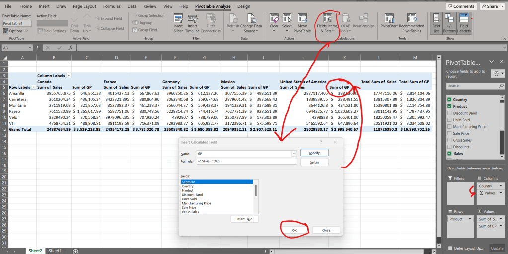
Another thing to point out here is that we now have more than one thing int he Values section of the field list on the right! Up to a certain point, new calculated columns will automatically be popped into the values box, but you’ll also notice some other magical nonsense happened in the columns box.
Since we have both a field, and the values moving in the columns space, the order here determines the layout. Right now, you’ll see sales and GP for each country grouped together, but if you pull Country down below the Values, It’ll show all of the sales columns together (one for each country), and then all of the GP columns. Confusing at first, perhaps, but super useful once you start working with pivots more often.
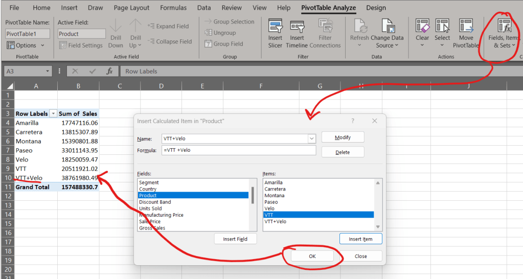
Calculated Items
Calculated items are a bit different. They perform calculations on the items within a specific field. For instance, you might have a “Region” field with items like “North,” “South,” “East,” and “West.” A calculated item could be used to calculate the combined sales of the “North” and “South” regions. Since this sample data doesn’t have such a convenient example, we’re going to play with the products again, and imagine VTT and Velo are different products in the same product line that we want to see a total for.
To create a calculated item:
- Click on a cell within the column/row of the field you want to add the calculated item to.
- Go to PivotTable Tools on the Ribbon, click on “Fields, Items & Sets,” then choose “Calculated Item.”
- In the dialog box, provide a name for your item.
- In the “Formula” field, create your formula. You can insert items by clicking on the “Items” button.
Field Properties
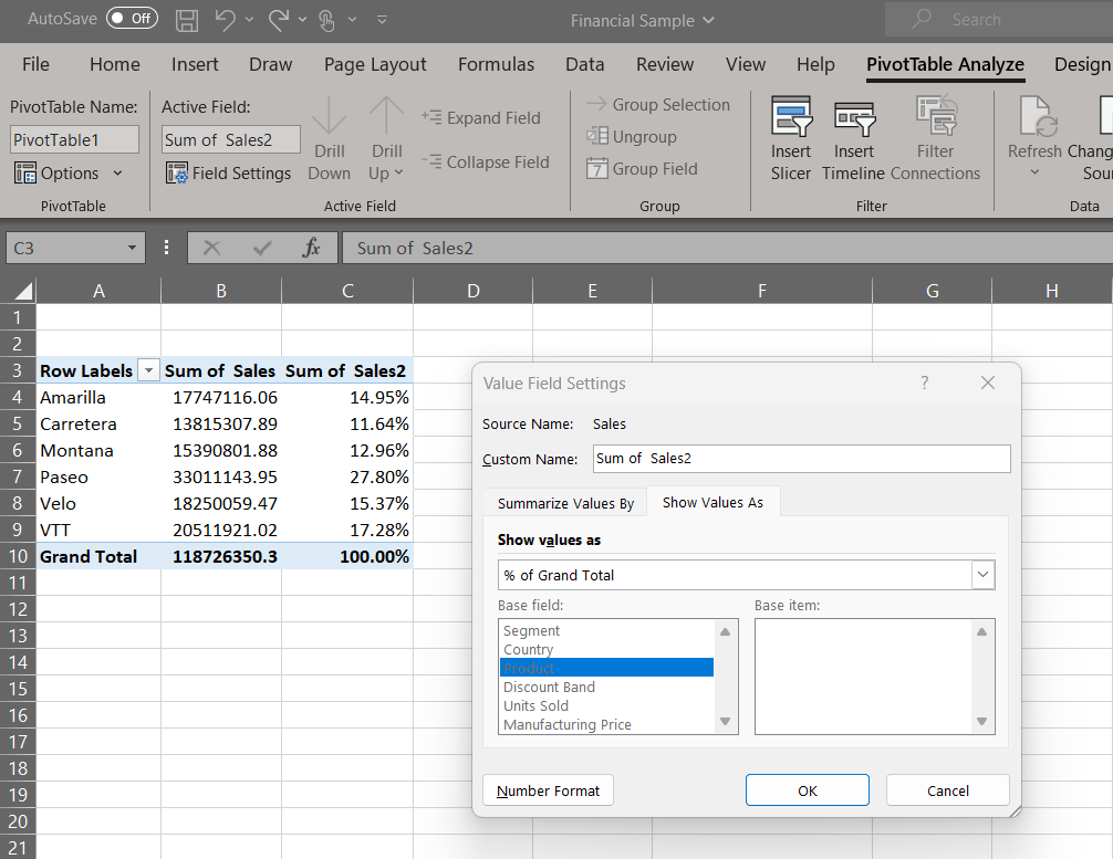
The field properties of a pivot table allow you to change how the data is displayed. For example, you might want to display your data as a percentage of the total, or rank your data.
To change field properties:
- Click on the drop-down arrow next to the field name in the PivotTable Field List (or double click on the field’s header)
- Select “Value Field Settings.”
- In the dialog box, select the calculation you want to use (like “% of Grand Total” to show values as a percentage of the total).
For instance, if you have sales data and want to see each Product’s contribution to total sales, select “% of Grand Total”. The pivot table will recalculate the data to display it as a percentage of the total sales. In my example, I pulled sales into the values again and did this with the second one for more clarity:
All of these functionalities of pivot tables offer a dynamic approach to data analysis. By creating calculated fields and items, as well as changing field properties, you can tailor your pivot table to best fit your data and the insights you aim to derive from it.
Grouping and Ungrouping Data
Another great thing about pivot tables is their ability to group items. Let’s say your sales data includes the exact dates of sales. That’s too much detail for your current analysis. You’re more interested in monthly or quarterly sales. With pivot tables, you can easily group the dates by month, quarter, or year, depending on what you need.
Here’s how:
- In your pivot table, right-click on one of the dates.
- Select “Group” from the dropdown menu.
- In the Group By dialog box, select the appropriate option (e.g., Months or Quarters) and click OK.
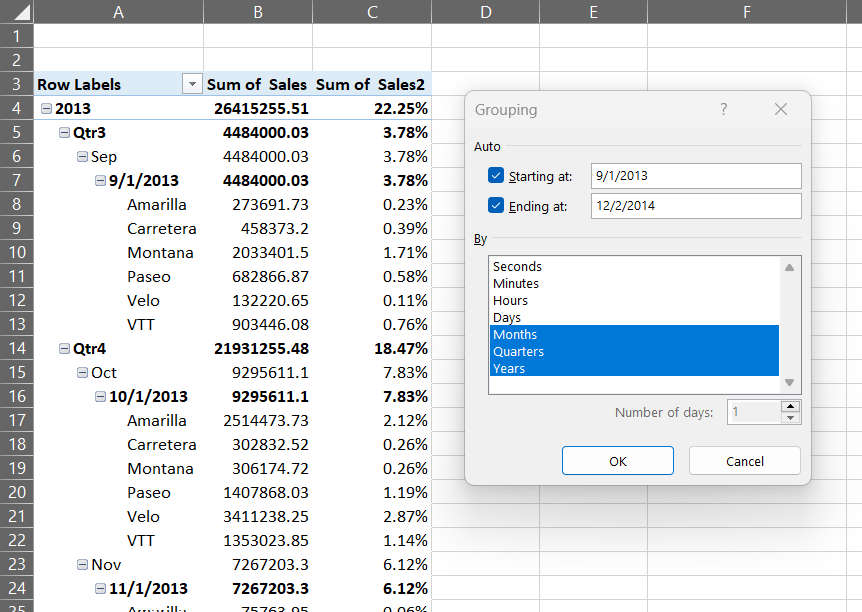
Just like that, your daily data is neatly grouped into the time period you selected. And if you want to see the daily data again, simply right-click and select Ungroup.
Refreshing Your Pivot Table
As you continue to add data to your spreadsheet, you’ll want your pivot table to reflect these changes. That’s when you’ll need to refresh your pivot table.
You can do this manually by clicking anywhere in your pivot table to display the PivotTable Tools on the Ribbon, and then selecting “Refresh.” Or, you can automate the process by going to PivotTable Options and checking the “Refresh data when opening the file” box.
Slicers and Timelines
Slicers and timelines are visual tools that make your pivot tables even more interactive. They allow you and your audience to quickly filter data, making your pivot tables easier to read and understand.
A slicer can be added by selecting your pivot table and going to the PivotTable Tools on the Ribbon, then clicking “Insert Slicer.” Choose the column you want to filter by, and a box will appear with buttons for each unique item in that column.
A timeline works similarly, but it’s specifically for dates. It’s a visual, interactive filter that allows you to filter your pivot table by time periods with a quick slider movement. It’s added in the same way as a slicer, but you choose “Insert Timeline” instead.
Final Thoughts
Pivot tables might seem complex at first glance, but once you understand how they work, they can simplify your data analysis significantly. They’re a powerful tool for crunching large data sets and extracting meaningful insights, and the fact that they reference a specific range makes them great for automation, as well.
Through creating, manipulating, and refreshing your pivot tables, along with using the slightly more advanced features that they provice like calculated fields, grouping data, and adding slicers or timelines, you can become a true data-crunching pro. The more you use pivot tables, the more you’ll appreciate their potential to summarize, transform, and present your data.
Remember, practice is key. So, don’t be afraid to experiment with your pivot tables and explore the different functionalities. The more you play with it, the more comfortable and proficient you’ll become. Happy data analyzing!


Leave a comment