

Ever stared at a spreadsheet full of numbers, struggling to make sense of it all? Don’t sweat it; we’ve all been there, and sometimes the summarization provided by a chart just doesn’t work. Enter Excel’s conditional formatting, a feature that can turn that number jungle into a beautiful, comprehensible garden. We’ll be focusing on Excel for this article because it fits the theme so far, and provides a solid overview, but we obviously can’t fit all of the details into a single post.
If you like what you see here, though, I’d recommend keeping an eye out for these features in other reporting tools; Conditional formatting is a feature in most spreadsheet software, reporting tools like Power BI and Tableau, and even on collaboration tools like SharePoint and Microsoft Lists!
Since I can see it being a possible cause for concern, I’ll be using a fairly realistic data sample for this article’s examples, but no real employee data was used.
What is Conditional Formatting?
Simply put, conditional formatting is a feature that lets you format cells in your spreadsheet based on their content. It’s like Excel’s version of a traffic light, giving you visual cues to help navigate your data. The same is true in other places where conditional formatting can be applied – it’s a tool that lets you define rules and automatically highlight values for attention and easier review.
The Basics
Alright, let’s get our hands dirty and set up some basic conditional formatting rules. Click on the cell or range of cells you want to format, then head over to the Home tab on the Ribbon and select Conditional Formatting. A drop-down menu will appear with a bunch of options. Don’t worry; we’ll walk through these together.
Highlighting Cells
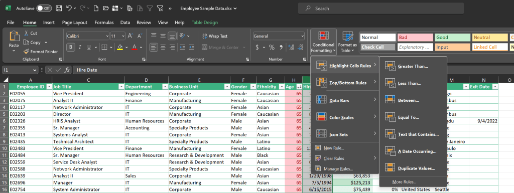
The first option on the menu is Highlight Cells Rules. This is where you can set rules based on specific conditions.
Let’s say you have a spreadsheet with your monthly expenses and you want to highlight any expense over $200. Select “Greater Than” from the menu, enter 200, and voila! All those pesky high-cost items are now lit up in your spreadsheet.
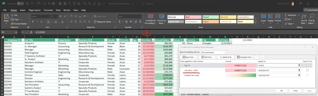
You can also set these rules up with cell references so that they’re more flexible. In this example, I’m highlighting the hire date of anyone who started after 1/1/2022 in column I, using the value in cell P1 (You can get to the ‘conditional formatting rules manager’ interface from the conditional formatting drop down on the ribbon; it’s the last option in the main panel). While this is a simple example, If you’re looking at sales and set up formulas to show what 10% above and below the average is, you can reference them and use the conditional formatting as an easy way to highlight every value above or below that range. Neat trick, eh?
Top/Bottom Rules
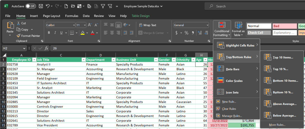
But what if you’re not just interested in expenses over a certain amount, but also want to see your top 10 expenses or the bottom 10? That’s where Top/Bottom Rules come into play. Choose “Top 10 Items” and Excel will highlight your top 10 expenses. Need to see the bottom 10 instead? Just change the rule to “Bottom 10 Items.”
Data Bars, Color Scales, and Icon Sets

If you’re a fan of colors, gradients, or icons, you’ll love this part. Data Bars fill the background of a cell with a color gradient based on its value, Color Scales change the cell’s color based on its value relative to others, and Icon Sets add icons next to your data for an extra layer of visualization.
Managing and Troubleshooting
If you’re having trouble with a rule not working as expected, double-check your conditions and make sure they’re set correctly. Excel applies the rules in the order they appear in the Rule Manager, so if you have conflicting rules, you might need to reorder them.
Real-life Use-cases
Imagine you’re a project manager tracking the progress of tasks. You could use conditional formatting to highlight tasks that are running behind schedule or to flag high-priority items. Or perhaps you’re tracking sales and want to quickly identify high-performing products or salespersons. Conditional formatting can do that too.
In short, conditional formatting is a powerful tool that can turn your spreadsheets into a dynamic and easy-to-understand dashboard. So the next time you’re knee-deep in a sea of spreadsheet data and the numbers start to blend together, remember: conditional formatting is your lifesaver! It’s not just about making your spreadsheet pretty. It’s about enhancing readability, revealing trends and patterns, and ultimately, making better decisions based on your data. So go ahead, give it a try, and watch as your data comes to life.
From highlighting critical budget overruns to flagging up top performers in a sales report, the potential applications for conditional formatting are almost endless. Just like Excel itself, it’s a feature that’s both incredibly powerful and highly customizable, allowing you to create the exact look and feel that you want for your data.
But, as with all things Excel, the key is practice. The more you experiment with different rules and conditions, the more confident you’ll become. And the more you use it, the more you’ll find it’s not just your spreadsheets that improve, but your overall understanding and appreciation of your data.
Happy formatting!


Leave a comment