

Data visualization is an art and a science, combining aesthetic design with statistical accuracy to tell the most compelling story of your data. Whether you’re tracking quarterly sales, forecasting weather patterns, or just trying to make sense of your monthly budget, the right chart or graph can make all the difference. So, let’s delve into some of the most commonly used data visuals and explore the ways they can amplify your data insights.

First in line is the classic Bar Chart. Imagine trying to compare the heights of various buildings across the globe. It wouldn’t be feasible to line them all up in a row, right? But if you create a bar chart, where each bar represents a building, with their heights proportional to the buildings they represent, you’ll have a crystal clear comparison. Bar charts are intuitive, straightforward and perfect for comparing different categories. They can also illustrate changes over time, but only when those changes are significant. But remember, try not to pack too many categories onto a single chart or your audience might lose the plot.
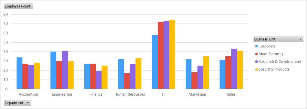
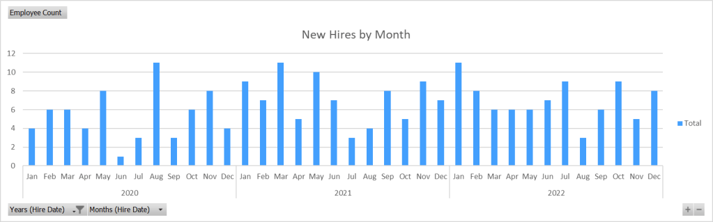
Next up, standing tall and proud, we have the Column Charts. These are like bar charts that have swapped the horizontal plane for the vertical. The categories are on the x-axis while the corresponding values stretch upwards on the y-axis. They’re perfect for showing data changes over a period of time or comparing items. But, much like bar charts, they can become messy if there are too many data points or if the category names are too long.
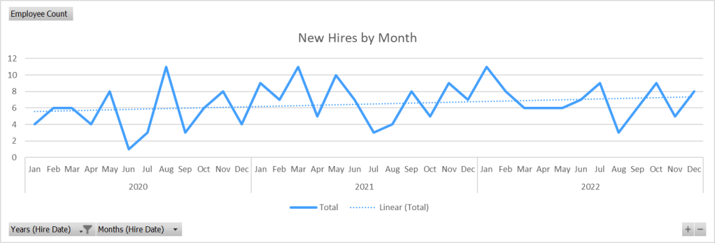
Let’s move on to Line Graphs. These are the masters of trend spotting. They connect individual data points with a continuous line, like an elaborate dot-to-dot puzzle, helping you to see the direction of your data over time (and they also work really well with trend line functions built into most analytics programs programs). They’re excellent for revealing patterns, showing changes at irregular intervals and even forecasting future trends. However, line graphs aren’t the best choice for comparing individual values, and they might mislead when there are multiple data points from a single time period.
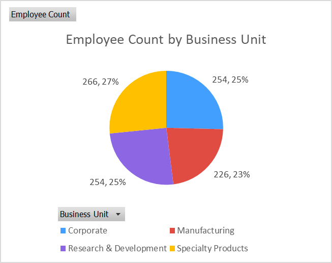
Ah, the Pie Charts, the pièce de résistance of many a PowerPoint presentation. They’re like a delicious pizza ruined by uneven slices, each slice representing a different category of your data. The size of each slice is proportional to its corresponding data value, letting you see at a glance the proportion each category contributes to the total. However, precision is not their strength, so when you need to compare data or show changes over time, it’s best to opt for a different chart.
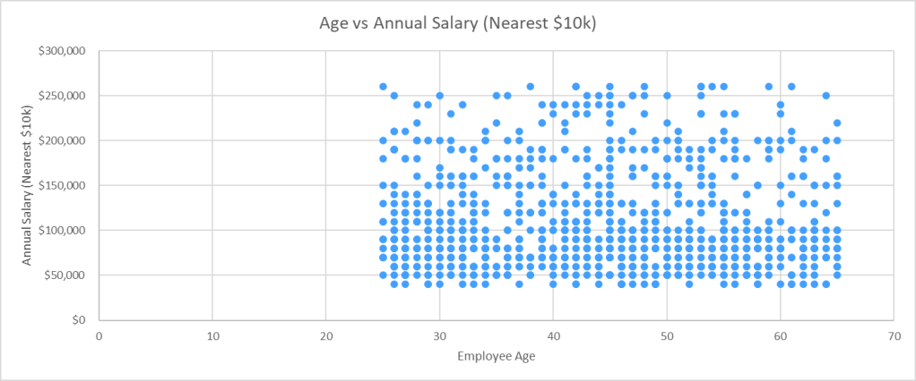
Onward to Scatter Plots. They’re like a game of connect-the-dots on a grand scale, displaying the relationship between two (or even three; usually the third is expressed by the size or color of the dot) different variables. Each dot represents an observation, its position dictated by the values of those variables. They’re great for showing correlations, identifying trends and clusters, and they can handle a lot of data. But, if you’re dealing with time-series data or categorized data, a scatter plot might not be the best choice.
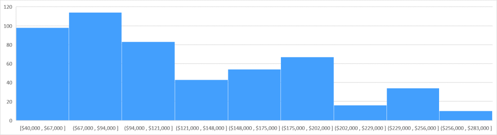
Now, let’s meet the Histogram. This is a column chart’s sophisticated cousin. Instead of comparing different categories, a histogram shows the distribution of continuous data over set intervals (bins – summarized categories in a range of values) or time periods. It’s perfect for when you want to know how your data is spread and for displaying the frequency of data intervals. But when you have nominal data or when you need to compare data between different groups, histograms might not cut it.
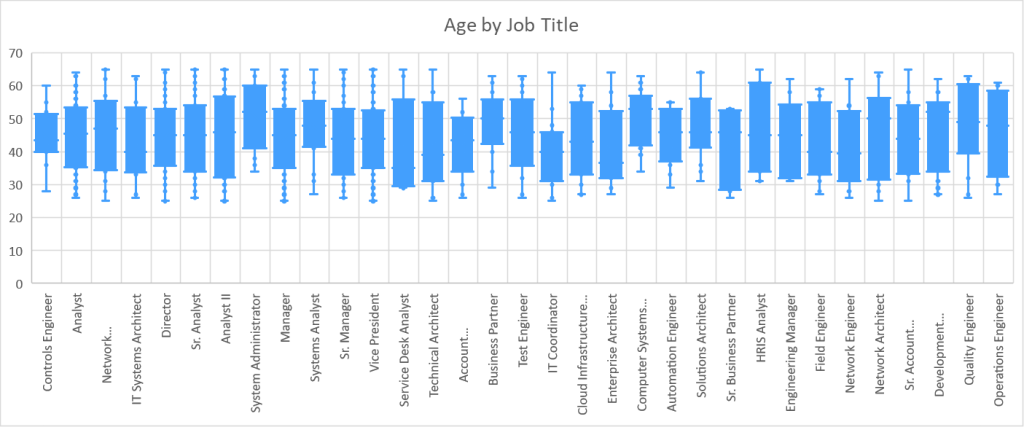
Last but not least, let’s take a look at Box and Whisker Plots. They might sound complicated, but they’re just another way to show the distribution of your data, especially when you want to spot outliers or understand the variation in your data. Commonly used in finance, and a popular choice for tracking stock trading data, they show data spread and skewness, outliers, and provide a quick visual of the data
distribution through quartiles, where the box represents the interquartile range (where 50% of your data lies) and the whiskers extend to show the range of the data. While box plots are a little more complex than some of the other chart types, they provide a comprehensive snapshot of your data’s distribution.
Let’s remember though, it’s not just about what these charts and graphs can do individually, but also how they can work in concert. Combining different types of visuals can often give a more nuanced picture of your data. For instance, a line graph showing sales trends over time may be paired with a column chart depicting total sales to provide a richer understanding of the company’s performance.
Moreover, customization is a powerful tool in your data visualization toolbox. Adjusting colors, sizes, labels, and other formatting options can make your charts more engaging and easier to understand. Even simple tweaks like highlighting a particular data point or using consistent colors for the same categories across multiple charts can significantly improve readability.
Another aspect to consider is your audience. The choice of data visual often depends on who will be interpreting it. A technical audience might appreciate more complex visuals like scatter plots or box and whisker plots, while a general audience might find bar or column charts more accessible.
Lastly, but most importantly, your choice of data visual should be guided by the story you want to tell. Are you trying to show trends over time? Are you comparing categories? Or perhaps, you’re showing the distribution or composition of your data? Each story has a visual that tells it best.
To conclude, selecting the right chart or graph can illuminate your data, highlight important insights, and make your presentation or report more effective. There’s a whole array of charts, graphs, and data visuals out there, each with its strengths and weaknesses. The key is to understand these tools and know when to use which one. So, the next time you find yourself diving into a spreadsheet full of data, remember, there’s a chart for that!
Happy visualizing!


Leave a comment