

Ahoy there, fellow data sailors!
Recommended song for this project:
“Sleeping in the cold below?” Not us, not today. We’re about to set sail on an adventure as exciting as any sea shanty, with a treasure more valuable than gold doubloons: data.
Yes, my brave companions, today we embark on a journey that spans the vast sea of the internet to the unexplored depths of Excel, Power Query, and Power BI. Together, we’ll dive into a bounty of data, as beautiful and wild as any ocean, navigating through its waves to discover its hidden truths.
I hear your concerns, “Excel and Power BI? Isn’t that as terrifying as a sea monster?” Fear not, for I will be your trusted captain, guiding you safely through the swirling storm of data procedures, making them an engaging and fun adventure. So hoist the main sail, grab your spyglass, and let’s cast off!
Whether you’re a seasoned data navigator or a new recruit on your maiden voyage, this guide is your trusty map. We’ll be charting a course with real-world data from the US Census Bureau, refining it until it gleams like the purest treasure. And the greatest part of our adventure? Once we’ve set our course, keeping our bearings will be as simple as the sea breeze. With just a few clicks, we’ll refresh all our data and our analysis.
Our destination? A masterfully crafted data report, a treasure trove of insights gleaming like a lighthouse in the dark. Ready to sing along to the rhythm of data exploration? Grab your sea shanty songbook, because we’re about to make waves!
All Hands to Battle Stations; Operation ‘Deep Below’ Commencing in 5…
Alright, adventurers, it’s time to do some hands-on work. Buckle up and let’s dive into Census Bureau Tables! The data source we’ll be using today can be found at “https://data.census.gov/table?t=Employment&y=2022“. I know, it’s a bit hefty and intimidating. But don’t worry, we’re in this together.
Like many challenges in life, this table is a little too big to fit nicely on the Census website, so we don’t get a preview. But hey, who doesn’t love a bit of a puzzle, right? We’ll need to download it first. Once you’ve tailored your filters, the site will generously offer you a download option. Kindly accept the zip file and unzip it somewhere on your local system. This is like opening a present – exciting, right?
Now, let’s pull up Excel with a new blank workbook. Look for the Data tab, and choose “Get Data”. From there, select the file named “PSEOEARNINGS.PSEOEARNINGS-Data” from your newly extracted folder.
Just wait for a bit while Excel does its magic, and voila – you’ll see a preview of the data. You’ll notice the Census data seems to have two column headers, which is quite handy, but it also means we need to do a little bit of cleaning. So on this screen, we’ll hit the ‘Transform’ button.
Next up is the Power Query editor. Here, we’re going to remove the top row to clean things up a bit. I chose to keep the longer text for column names. I find it looks nicer, and it’s easier for our future selves to understand what each column represents.
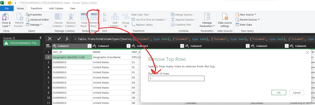
You’ll quickly notice that all of the columns are still labeled as “Column1, Column2”, and so on. It feels impersonal, doesn’t it? But fear not, we can quickly fix it by clicking on the “Use First Row as Headers” button in the ribbon.
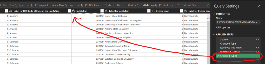
If we take a quick peek at the “Applied Steps” box on the right, we’ll notice a new step added and some ominous red highlights under some of the column headers. Don’t panic, it’s just Power Query being, well, Power Query.
Now it’s time for some detective work. We can make an educated guess that those red lines indicate issues, probably because the text columns have been changed to numbers. So let’s verify our hunch by scrolling down a bit and looking for a cell containing “Error”.
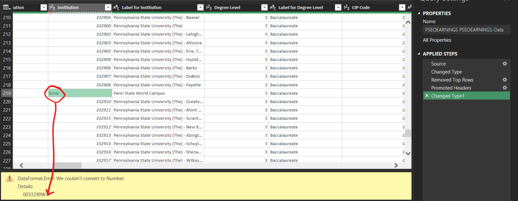
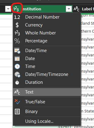
Surprise, surprise – there’s a W in there! That’s definitely not number-like. We’ll need to change this column back to text by clicking the “123” beside the column name, and selecting “Text”. I’d recommend changing the current step, unless you have a very specific reason to add a new one.
Alright, take a breather, grab some coffee, and let’s proceed. We’re on a roll!
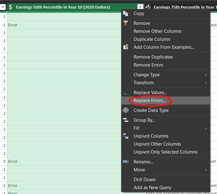
As we traverse the dataset, there are some columns with unexpected text like “Data not available to compute this estimate”. Since we want those columns to be numbers for calculation, let’s change them to currency (USD). Now, you might worry about the error we’ve been fixing spreading, but don’t worry – we’ve got tools to handle that. Right click the column header after you change the column’s data type, and select “Replace Errors”. You’ll get a pop up, and type ‘null’ in the replace with box. Null is a special indicator, indicating a field that was intentionally left empty, ideal for this situation.
Now, to make our data presentable and ready for use, click “Close and Load” in the Power Query window. You’ll notice Excel has generated a new tab named after the query. But let’s face it, Excel isn’t the best at naming things, right? So, let’s take charge and rename this tab to something clear and meaningful, like “QueryTable”. Just double-click the worksheet name tab and type away!
Now, for those who’ve been following our previous articles (big thanks to you all), you’re already familiar with pivot tables. So let’s dive in and get our hands dirty. Click anywhere in the table, navigate to the Insert tab, and select “Pivot Table”. Sounds like we’re on a quest, doesn’t it?
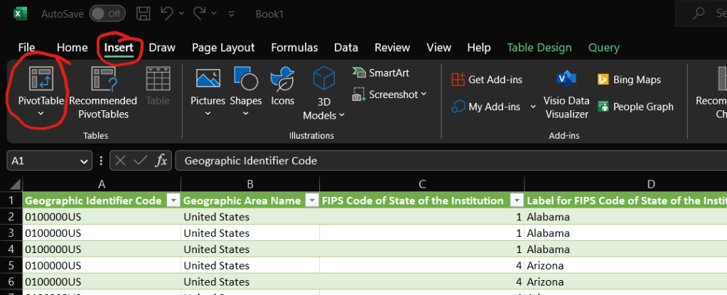
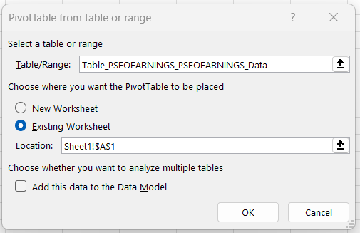
Next, let’s insert our pivot table onto Sheet1. No need to waste space, right? You can do this by clicking the little arrow icon on the right of the input box, selecting where you want it, and clicking the icon again. It’s just like pinning a location on a map!
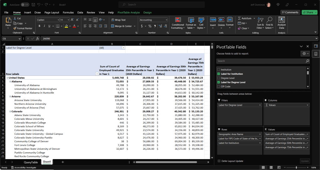
Staring at a blank pivot table can feel like being lost in a desert, but don’t worry, we’ve got our field list as our guide. Let’s start populating our pivot table by dragging fields into the row, column, and values fields. Have a look at what I’ve done below, but feel free to add your own spin. Remember, it’s your journey!
Looking back at our journey, we’ve accomplished quite a bit, haven’t we? We’ve:
- Discovered an open data set on the internet (courtesy of the US Census)
- Downloaded and unpacked that into our project folder
- Imported it into Excel using the fearsome capabilities of Power Query
- Cleaned the data, making it neat and useful
- Done some exploration in a pivot table to create a handy summary
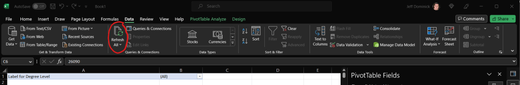
And the icing on the cake? If we decide to update our data in a year or so, all we have to do is download the updated file from the census site, extract it into the same folder, and click “Refresh All” in Excel’s data tab. That’s right, everything we’ve done so far can be repeated with just a few clicks.
Pretty cool introduction to a basic, yet semi-automated ETL process with Excel, Power Query, and Pivot tables, eh? But wait, there’s more! While we’ve done some great work in Excel, it’s not my go-to tool for visualization. So let’s shift gears and hop on over to Power BI.
I can already hear some of you groaning. “Are you asking us to redo everything in a different tool?” Absolutely not! We’re smarter than that. We can actually go back into our Power Query Editor, and copy the contents of the advanced editor from Excel into a blank query in Power BI.

Here’s how: Open the advanced editor in Excel, select everything in the main screen of the pop-up, and hit Ctrl+C to copy. Now, open a blank query in Power BI, open the advanced editor, and paste everything in. Simple as that! Since both tools use Power Query, the exact same M code will work in both.
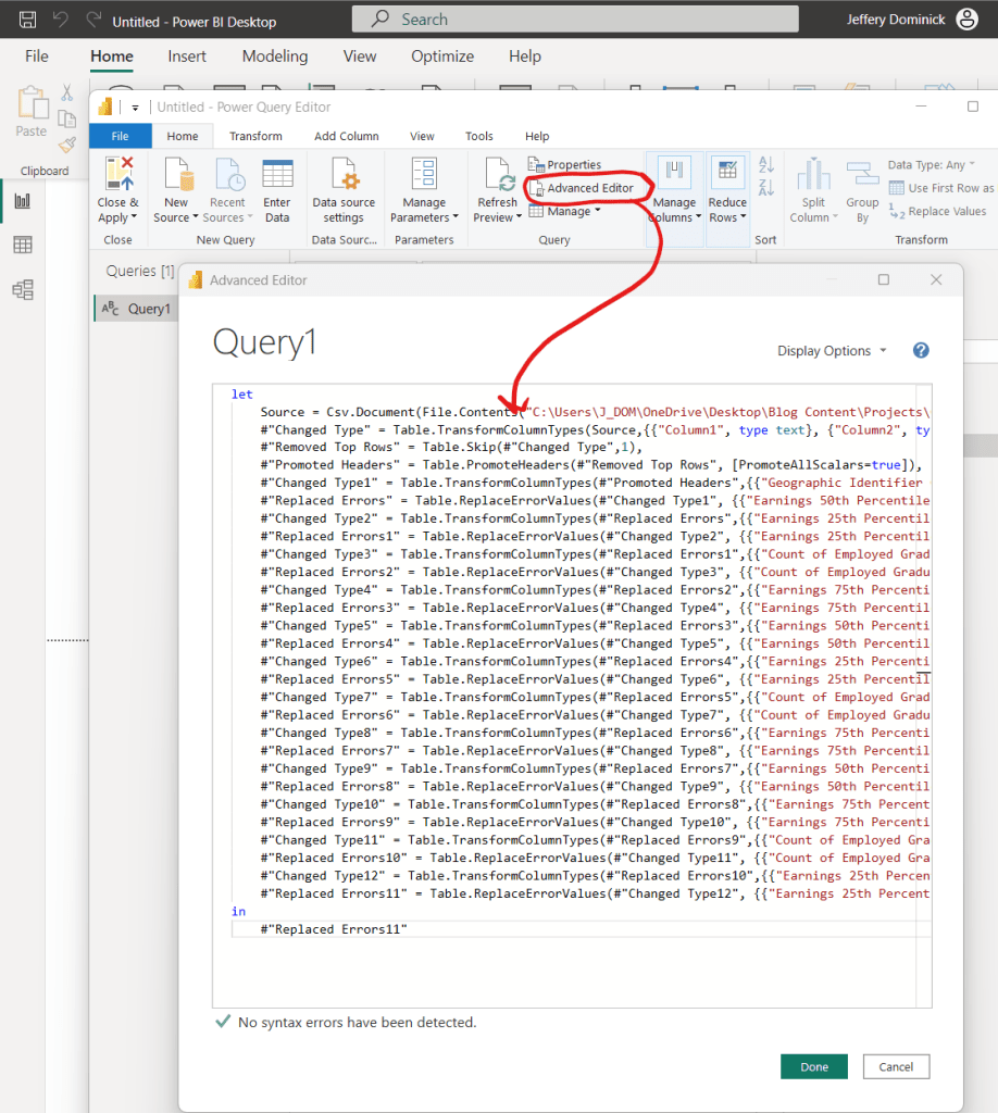
Once that’s done, click “Close & Apply” and we’re ready to beautify our data!
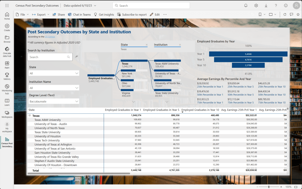
We’ll delve deeper into the world of Power BI later (I’ve got a thing for layout and design principles), but for now, it’s all about dragging and dropping. Select the visual you want, add it to the screen, and then add fields just like we did with the pivot table. Who knows? You may end up with something that looks like this, which we’ll get back to later:
After Action Report
Well, there we have it, my fellow data navigators – we’ve weathered the storm of data analysis, navigated the wild sea of Power Query, and docked at the promising shores of Power BI. Together, we’ve transformed what once was an impenetrable fortress of raw data into a beacon of insightful knowledge. No longer are we “Sleeping in the Cold Below,” we’re sailing atop the vast sea of data, masters of our own voyage!
Remember, this isn’t a one-time adventure – the ocean of data is boundless, and there are countless treasures still waiting to be discovered. So, as you venture into your own data explorations, remember the journey we’ve embarked on today. Use these tools, follow the same course, and soon, you’ll be navigating the data waves with confidence and ease.
Like any good sea shanty, the journey is best when shared. So spread the word! Share your newfound knowledge with your crew – your colleagues, friends, or anyone else embarking on their own data exploration voyage.
So, what’s next, you ask? Well, the horizon is full of possibilities. We’ll continue to explore, to delve into the depths of data analysis, visualization, and interpretation, and probably try to keep writing up new projects for us to sail through together. But for now, enjoy the victories of today’s journey.
Stay curious, keep exploring, and remember: in the vast ocean of data, the only true limit is the sky above. Until our next adventure, fair winds and following seas, my friends!


Leave a comment